
Dynamics

|
Generational Dynamics |
| Forecasting America's Destiny ... and the World's | |
| HOME WEB LOG COUNTRY WIKI COMMENT FORUM DOWNLOADS ABOUT | |
|
These pages contain the complete rough draft manuscript of the new book
Generational Dynamics for Historians,
written by John J. Xenakis.
This text is fully copyrighted. You may copy or print out this
material for your own use, but not for distribution to others.
Comments are invited. Send them to mailto:comments@generationaldynamics.com. |
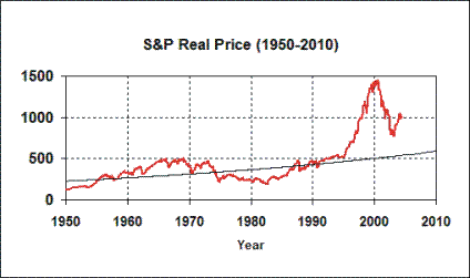 |
The adjacent graph depicts the S&P 500 Index, inflation adjusted, from 1950 to the present. Note the stock market bubble that began in 1995.
Why did the 1990s stock market bubble start in 1995? Why not 1985 or 1990 or 2000?
There are literally thousands of economic analysts writing today, and probably almost all of them have written about the 1990s stock bubble. But not a single one of them can answer that question -- why did the stock market bubble start in 1995?
Not one of them has an economic model that provides an answer. They'll do analyses based on gold prices, interest rates, technology, war, or whatever. But not a single one of those models or analyses provides an explanation.
| |||||||||||||||||||||||||||||||||||||||||||||||||||||||||||||||||||||||||||||||||||||||||||||||||||||||||||||||
But there must be some reason. Did the Russians release poison gas into the atmosphere in 1995? Did Martians land and control investors' minds?
This book provides the one and only plausible explanation: Prior to the 1990s, all the senior financial managers at all investment firms were people who had lived through the Great Depression of the 1930s, and had personal memories of the massive bankruptcies, starvation, unemployment and homelessness. These cautious, risk-averse managers guided our country through decades of prosperity.
In the 1990s, the people in the generation that had grown up during the Great Depression all disappeared (retired or died) all at once. By 1995, the senior financial managers were in the generation of Baby Boomers with no personal memory of the Great Depression. These risk-seeking managers made the riskiest, most moronic investments possible, investments that their retired predecessors would never have made.
The generational explanation is the only one that makes sense. The fact that other economic models fail to explain why the bubble occurred in 1995 should be reason enough to doubt what they're telling you.
This chapter develops the Generational Dynamics forecasting model, and forecasts where we're going today: A new 1930s style Great Depression, with the DJIA falling to 3000, and with a return to massive unemployment, bankruptcies, homelessness and starvation.
Short-term financial forecasts are even less accurate than weather forecasts, and don't last as long.
If you listen to the weather forecasts on the radio in the morning, they'll probably be accurate for the entire day. If you listen to stock market forecasts in the morning, there's a good chance they'll be wrong by 11 am.
Even retrospective explanations are bizarre. An evening business report might say, "Stocks went up today on the news that oil prices were falling." Then, the next evening, it'll be, "Stocks went up today as investors were unfazed by rising oil prices." What the heck is that all about? It's pretty clear that professional analysts don't have a clue, except in the most obvious cases, why the stock market goes up and down. I'll go so far as to say that 98% of all stock market forecasts and post mortem explanations are complete nonsense, having no more credibility than a dart board.
Actually, that shouldn't surprise anyone, since the daily ups and downs of the stock market are totally chaotic and extremely volatile. The thing that's surprising is that so many investors actually pay attention to these forecasts. People listen to weather forecasts too, but at least that makes sense; listening to financial forecasts appears to make no sense.
There's almost never any bad news among financial forecasters. When stocks go up, then it's good news because stocks are going up; when stocks go down, then it's good news because prices are low and people can buy more stocks cheaply.
On the rare occasions when some analysts forecast bad news, as Berkshire Hathaway Inc. head Warren Buffett and Morgan Stanley chief economist Stephen Roach have done, then those analysts are ignored, or referred to as "bears" and marginalized.
The Governors at the Federal Reserve Bank, the group that's supposed to be in charge of keeping the economy, has also been saying strange things. According to statements by Fed Governor Ben Bernanke, a colleague of Alan Greenspan, the Fed governors believe that they can control stock prices and long-term interest rates just by publishing regular forecasts. We'll have more to say about the Fed later.
If short-term financial forecasts are useless, then the "long-term forecasting" techniques that we described in the previous chapter are not. This means that we can predict our destination, but not the path we'll follow to get there.
In the case of the stock market, it should be a lot simpler to do long-term forecasting, because we can easily graph the stock market, something we can't as easily do with wars.
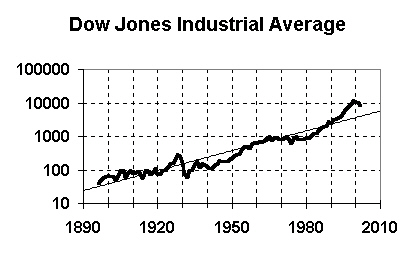 |
Take a look at the adjoining graph, and you'll see just how easy it is. The heavy squiggly line is the DJIA, and the thin straight line is the long-term exponential growth trend line. Since the DJIA must follow the trend line in the long run, we can easily see that the DJIA is going to fall substantially from where it is today (early 2005).
How much? Well, the trend value in early 2005 is 4670, and in the year 2010 is about 5800, but the actual DJIA today is between 10,000 and 11,000. Thus we can expect the DJIA to fall substantially in order to be consistent with the long-term trend. Moreover, the trend line represents an average, so the DJIA will have to fall far below 5800 to compensate for the large bubble. A fall to the 3000 range seems like a reasonable conclusion.
|
Some people say that the DJIA index is not a valid measure because it contains only 30 stocks, selected by a news organization (Dow Jones). However, the adjoining graph shows the same thing with the S&P 500 index, graphed in constant dollars. The 2010 trend value is 589, so the results are comparable to those obtained with the DJIA.
Why must the stock indexes follow the trend line in the long run? I answered this question in a very lengthy chapter in my last book, and I won't attempt to repeat the material on exponential trend forecasting here. But here's some additional information.
Over the long term, a stock index represents the real value of the underlying companies, in terms of the goods and services they can produce. If you examine the S&P index graph during the period 1890 to 1990, you find that the index grows at an average rate of 1.34% per year. But you can see from the above graph that something went very wrong around 1995, and the index spiked upward, and the average growth in the index from 1990 to 2004 was 6.10%.
 |
The adjoining graph shows this even more clearly. The index was leveling off in a normal cyclic way, but suddenly the curve spiked up so sharply. The second derivative had been negative, but suddenly jumped to a positive value in a discontinuous manner. The change was so sharp that the first derivative appears discontinuous as well.
Now, such a sudden change requires an explanation. From the point of view of Generational Dynamics, the reason is this: Until the early 1990s, all senior financial managers around the country and the world are people who personally had lived through the Great Depression, and remembered the horror of the massive starvation, bankruptcy and homelessness. These risk-averse people made only cautious, prudent investments, and demanded tight financial controls.
In the early 1990s, all the senior managers in the generation of risk-averse people who had personal memories of the Great Depression all disappeared (retired or died), all at once, and were replaced by managers from the highly risk-seeking Boomer generation, with no personal memory of the Great Depression. The tipping point in the generational change occurred in 1995. At that time, the new generation of managers started making one risky, irresponsible investment decision after another, and completely lost control of expenses in companies around the world. This created the bubble.
So now, here's the problem we have today. The underlying value of companies in the S&P index increased by an average of 1.34% per year from 1890 to 1990. Thus, we can conclude with some certainty that the underlying value of these companies grew at 1.34% per year from 1990-2004. But the stock value grew at 6.10% per year in those years. So stock values (market capitalization) grew 4.5 times as fast as the companies these represented. Today, stocks are overvalued by around 100%. Another way of measuring this fact is with price/earnings ratios, which we'll discuss later in this chapter. This means that a major correction will be coming soon.
As we said above, long-term forecasting tells us that stock prices will fall to Dow 3000, but doesn't tell us how or when we'll get there. Let's now look at short-term forecasting techniques that let us narrow down the range of scenario possibilities.
Long-term forecasting tells us our destination, without telling us how we'll get there, or how long it will take. Combining it with short-term forecasting can give us some information about how we'll get there.
We discussed this in the last chapter, but let's dwell on this subject again because forecasting financial trends is a little different.
Let's take an example. Suppose someone takes a car trip from New York to Los Angeles every year, but takes a different route every time. If you're an outsider watching the car leave NYC, then you know that the car is heading to LA -- that's long-term forecasting -- but you don't know what route it will take, or how long it will take to get there.
You could look at previous trips, and you find that some trips took 4-6 days, and other trips took 25-30 days. It all depends on whether the car took a direct or indirect route, and whether there were any breakdowns or stopovers.
So as the car leaves NYC this time, you can only estimate that it will be traveling to LA, and the trip will take between 4 and 30 days. You might be able to refine this forecast a little by probabilistic means. For example, if 25% of all the previous trips took 20 days, then you can predict that this trip will take 20 days with probability 25%.
So how does short-term forecasting fit into this? It fits in as the car approaches LA. At some point, the car will cross the California state line. Maybe it took 4 days to get there, or maybe it took 29 days. It makes no difference.
Now we can look back at all the other trips, and see how long it took to finish the trip, after the car crossed the California border. We see that it always took one or two more days to reach LA. So at that point, we can use this as a historical comparison and safely predict that the trip will take one or two days more this time.
But when you do this kind of analysis, you have to stick to an important rule: When you use this kind of historical comparison, you may only compare the same points in different cycles. For example, it does you no good to look at what happened when the car crossed the Kansas border to predict what will happen when the car crosses the California border.
This is a mistake that journalists, pundits and analysts make all the time. They compare a recession in the early 2000s to a recession in the 1990s, the 1980s or the 1960s. Those comparisons are meaningless because they occur at different points in the economic cycle.
If you want to make a historical comparison to the early 2000s, which followed a huge secular stock market bubble in the 1990s, then you have to compare it to the period immediately following the last secular stock market bubble, in the 1920s.
One such comparison can be made using standard price/earnings ratios.
As we described earlier in this chapter, the prices of stocks have spiked way above the real values of their underlying companies the stocks represent. We estimated that the value of an S&P 500 company grows by an average of 1.34% per year, but since 1990, the S&P 500 stock index has grown at 6.10% per year. This has created an imbalance, where stocks are overpriced by at least a factor of two.
One way of measuring this is by comparing the price of a stock with the earnings of the company. The amount of money that a company earns is a good proxy for the real value of the company.
When the price/earnings ratio is 25, it roughly means that a company is earning $1.00 per year for each $25.00 in the price of its stock. This roughly means that an investor buying that stock can hope to earn only $1.00/$25.00 or 4% per year. At a P/E ratio of 20, the rate is $1.00/$20.00, or 5% per year.
Historically, the S&P 500 P/E ratio has averaged around 14. This corresponds to an interest rate of roughly 7%. Thus, depending on the era, you could theoretically earn 7% interest by investing in the stock market, or you could earn around 5% interest in a bank, or 4% or so by investing in Treasury bonds. The differences in interest rates have to do with risk. You earn more in stocks because there's a risk of losing everything, while you earn less in government bonds because they're backed up by the national treasury, and there's little risk.
A P/E ratio can be computed for an individual stock or for an entire group of stocks. An individual stock with a P/E ratio above 17 is considered overpriced, while a stock with a P/E ratio below 10 is considered underpriced. If the S&P 500 P/E index is above 17, then the entire stock market is considered overpriced.
 |
The adjacent graph shows the S&P 500 P/E ratio index since 1881. As you can see, every time in the last century it exceeded 20, it fell below 10 within 5-15 years. It went above 20 in 1995, so as of this writing, in early 2005, it's been above 20 for ten years, so a substantial collapse is just about due.
Notice that the 2000 spike went much higher than the 1929 spike, because the generational change leading to the spike began from a higher base. This will be discussed later in this chapter.
So, let's summarize where we are now:
Now let's look at a more "anecdotal" kind of short-term forecasting.
Earlier we gave an example of a car traveling from NYC to LA, and we discussed how the forecast becomes much more accurate when the car is close to LA.
Well, if we're heading for a financial crisis, then how do we're know that we're close to it?
There's something of a logical paradox about this: If there's going to be a major financial crisis (like a stock market crash leading to a Great Depression), then it has to be a surprise to the general public, because if it weren't a surprise, then the general public would already have panicked, and the financial crisis would already have begun previously. Therefore, the general public must be ignorant of the danger until the crisis actually occurs. The same is true of major investors as well.
This sounds like one of those logic puzzles that you see in newspapers. "The sentence following this one is true. The sentence preceding this one is false." If you analyze it, each sentence is true if and only if it's false.
But this chapter is not about a logical paradox. It's quite true that the general public and most investors cannot know about a major financial crisis until it happens. There's a strange thing going on today.
I speak to a lot of people, and I've learned something remarkable: Evidently many, many investors today are aware that "something is wrong" with the stock market, and they plan to sell "soon," but they think that they can get out in time. Even those who've already lost money in the 2000 Nasdaq crash seem to have no fear. They're certain that they'll be "smarter" this time around, and get out fast when they see the warning signs.
As I write this in January, 2005, I can see this happening. One person told me, "I can't sell now with the market down. I'll sell in a couple of months when the market is up again." I told him that he's playing with fire, and he's in danger of losing everything, but it didn't matter.
 |
The adjoining graph shows the DJIA for Jan 24 2004 to Jan 24 2005. It's as addicting as a roller coaster ride. It even looks like a roller coaster ride.
This only sharpens the apparent logical contradiction we described above. We know that "getting out in time" is a zero-sum game, and that only a few people will actually succeed at doing that. Therefore we know that most of the people who believe they can get out in time will not be able to do so. It therefore follows that the next collapse won't take four years, as it did in 1929-1933, but will occur so quickly that almost all investors will be unable to react in time.
The following graphic reveals what you can and cannot forecast in terms of stock prices:
 |
The above graph contains several elements. Let's look at them one at a time.
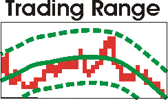 |
In terms of Chaos Theory and Complex Systems theory, we can see the following from the first diagram:
Now let's zero in on a couple of the elements in the graphic.
The exponential line in the S&P 500 Index graph is a long-term trend line. Let's look at some numbers:
(Prices are inflation adjusted.)
These figures show that something terribly wrong has happened since 1990. Earnings continued to grow at an average annual rate of 1.34% (we assume), and so stock prices should have continued to increase at 1.34% annually, not 6.10%.
This indicates that stocks are vastly overpriced today, and that a very painful adjustment will occur very soon.
Let's look at it from the point of view of price/earnings ratios.
 |
During the period 1890 to 1990, the S&P 500 P/E ratio averaged 14.5. It's been above 20 since 1995.
[Note: I use Yale Professor Robert J. Shiller's figures on his web site at http://www.econ.yale.edu/~shiller/data.htm, where he's collected annual stock market data since 1871, and very generously makes them available to the public. Shiller computes the P/E ratios using today's stock prices and dividing by the average earnings per share value over the preceding ten years. This is the most solid method, in my opinion, and is the best to use when you're doing long-term analyses and forecasting future values. You can also divide prices by previous year's earnings. In that case, the averge is 13.2 instead of 14.5.]
Examining the adjacent graph, you can see that whenever the P/E ratio goes above 20, then it goes below 10 in 5-15 years. It's been above 20 for 10 years, so a major stock market adjustment is due soon.
Before too much longer, there will be a major stock market adjustment that will bring the S&P price index to the 300-400 range and the Dow Jones Industrial Average down to the 3000-4000 range. This will cause a 1930s style depression, full of bankruptcies and homelessness. There's no uncertainty about this.
These fallacies and hoaxes are fairly common in the media -- and by that I mean all the media. You'd think that the Wall Street Journal or CNBC would be rigorous and accurate, but in fact they're just as sloppy and credulous as the most simplistic financial blogger.
It's a generational thing. Financial reporting is done by kids who think that the 1990s bubble is the way it's always supposed to be. It absolutely astounds me how many of these supposedly intelligent reporters say something to imply that we're just a blip away from returning the same kind of stock price increases.
The Dow 36000 fallacy was popularized in a book by supposedly intelligent analysts James Glassman and Kevin Hasset called Dow 36,000: The New Strategy for Profiting From the Coming Rise in the Stock Market. Ironically, this book was published in 2000, just as the Nasdaq crash was beginning. All the TV pundits were talking about it and gushing over it. It just goes to show how dumb these TV pundits are.
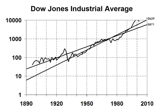 |
The fallacy is illustrated by the adjoining graph. There are two trend lines shown. The less steeply inclined line is the one we've been using - it computes a trend value of 5871 in 2010.
The steeper trend line computes a trend line of 10629 in 2010, and reaches 36000 by 2030.
The second trend line is computed by doing an exponential fit from the years 1932 to present. This illustrates the danger of using exponential curve fitting with inadequate data.
If you're doing exponential curve fitting, you should use as much data as possible, preferably several cycles of whatever you're trying to measure. We used all the data that was available - back to 1896.
Using data only from 1932 is a fallacious method of skewing the result. The data being fitted starts at the lowest point, which has the effect of rotating the line, as you see in the graph.
The Dow 300 fallacy is based on the following graph:
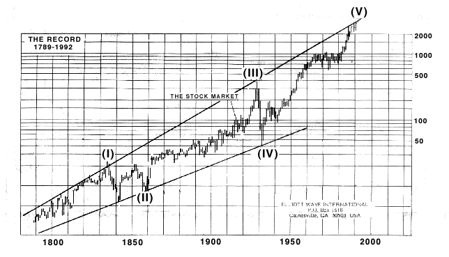 |
The people promulgating this fallacy impute some Dow Jones Industrial Average figures back to 1789, and predicted that the Dow would fall to 300 based on the line at the bottom that goes through points (II) and (IV). The trend value is 300 in the 2010 time frame.
You can't do exponential trend analysis on two points. The results are garbage. You must use as many points as possible.
This one appears to be an actual hoax, since I believe that the author is intelligent enough to know that what he's doing is wrong.
Harry S. Dent has written a book called The Next Great Bubble Boom: How to Profit from the Greatest Boom in History, 2005-2009. He claims that we're about to experience a bubble economy like the 1920s. He makes this claim based on a faulty generational argument that purposely obscures the facts.
Obviously, we've just left a bubble economy like the 1920s, and today we're still suffering the aftereffects. There's absolutely no support for Dent's claim, but people who believe him are going to be badly hurt.
Some journalists, pundits and high-priced analysts have been saying that we're out of the woods because the S&P P/E index today is around 16 or 17, which is close to the average.
There are two problems with this argument. First, this is a "wishful thinking" argument which computes the current P/E ratio by dividing today's stock prices by next year's projected earnings. This is a complete crock, and makes the whole computation worthless. It goes to show how much in denial these people are.
The second problem is that 14.5 isn't a minimum; it's an average. History shows that the average will be maintained, so the adjustment will bring the P/E index to below 10, probably around 5 or 6, as happened several times in the 1900s, most recently in 1982.
A Wall Street Journal series on Alan Greenspan's legacy gives his remarkable explanation for the cause of the 1990s bubble. As we'll see, the explanation contains some fundamental errors.
The front-page two-part article (Part I and Part II) examines Greenspan's record in detail since he took over the Federal Reserve 17 years ago.
One of the most remarkable aspects of the article, something I've never heard before, is that Greenspan's reasoning in 1996 was based on his belief that the bubble was caused by increased productivity from hi-tech investments.
I've been in the computer industry my whole life, and I can tell you that is about the dumbest thing I've ever heard. Only someone who knew little about computer technology could possibly believe hi-tech investments were increasing productivity.
In the 1980s and 1990s, IT was a monetary black hole. A typical development project was one or two years late -- if it didn't fail completely.
It's true that productivity was improved in some ways; for example, managers used PCs to type their own memos with word processors and their own budgets with spreadsheets. But those savings were no more spectacular than the productivity improvements from electric typewriters and Xerox machines in earlier decades.
So Greenspan and the Fed did nothing to stop the 1990s bubble, and the reason is that he had this total misunderstanding about information technology. Even worse, the article says that Greenspan knew he would have trouble convincing his colleagues of his theory, so he asked two economist interns on his staff to do a study, and let's face it: he told them what result he wanted the study to get. Incredible!
Here are the relevant paragraphs from the WSJ article:
Mr. Greenspan listened without tipping his hand. He had noted the same developments but reached a different conclusion based on his analysis of worker-productivity numbers.
Like many economists, Mr. Greenspan had long wondered why the spread of computers in the 1970s and 1980s hadn't boosted productivity, or output per hour of work. He was taken with the argument of economic historian Paul David, who noted that electricity didn't boost productivity for decades until working patterns adjusted. Mr. David suggested the same lag applied to computers.
Mr. Greenspan now saw surging orders for high-tech equipment since 1993 -- coupled with higher profits at the companies that bought the equipment -- as evidence the productivity payoff had arrived. If this effect was real, it meant economists were underestimating how fast the economy could grow before inflation reared its head. Companies could produce more without incurring the cost of hiring fresh labor.
Mr. Greenspan disagreed and told the committee he wanted to hold rates firm. An important reason, he argued, was that the government's productivity data were wrong. According to an analysis he commissioned from two Fed economists, productivity since 1990 in many services industries such as health care must have declined if the government's numbers were accurate.
This "makes no sense," Mr. Greenspan told the meeting. "The tremendous contraction in productivity, which all of our data show, is partially phony." Instead, he pointed to other government reports showing that companies were recording ever-wider profit margins without raising prices, a sure sign of productivity gains. "Productivity is indeed rising a lot faster than our statistics indicate."
Many committee members remained skeptical....
Greenspan's analysis of the 1990s bubble simply doesn't make sense.
Why did the S&P index turn sharply upward in 1995? Why not 1990 or 2000? What was different about 1995?
Greenspan provides an explanation having to do with increased productivity from computer technology, but that doesn't make sense. For every little island of increased business productivity in the 1980s and 1990s, there were enormous training and development costs that wiped the productivity savings out. Greenspan ignored the data that said that productivity was decreasing, but in fact those data values were correct, and Greenspan was wrong.
We now know that productivity has increased only in the 2000s. After the Y2K problem was resolved, companies simply stopped hiring IT professionals, and outsourced many IT jobs to lower-salaried employees in India and other countries. The result was a hiring crisis among IT employees in America, but an enormous productivity boon for companies, who finally began getting a return on their huge IT investments in the 1990s. But that wasn't happening in 1996, when Greenspan thought it was happening.
The generational paradigm is the one plausible explanation for the 1995 upturn: Prior to 1995, all the senior financial managers throughout the country were from the generation of "depression babies." These risk-averse people didn't part with a cent unless they were sure they would get it back, with interest.
During the 1990s, those people all disappeared (retired or died), all at once. The new senior financial managers were from the risk-seeking Baby Boomer generation who believed that the world owed them a living. The result was an explosion of unsafe investments, causing the bubble, which was nothing more than a pyramid scheme that the widespread use of derivatives has simply prolonged. The "depression babies" would never have fallen for that.
In January, 2005, Greenspan repudiated his own reasoning. Actually, his speeches had been getting increasingly alarming through 2004, but in a speech to the Advancing Enterprise 2005 Conference in London, he said that major structural changes have occurred since 1995 (the year that the stock market bubble began), in the world economy, thanks to a huge increase in globalization:
International trade has been expanding as a share of world gross domestic product since the end of World War II. Yet through 1995, the expansion was essentially a balanced grossing up of cross-border flows. Only in the past decade has expanding trade been associated with the emergence of ever-larger U.S. current account deficits, lesser deficits elsewhere, matched by a corresponding widening of external surpluses in a majority of trading nations.
This is the important point: That something fundamental has changed, something that hasn't been seen before. "The dramatic advances over the past decade in virtually all measures of globalisation have resulted in an international economic environment with little relevant historical precedent," he said.
Greenspan was acknowledging that the reasoning he gave for ignoring the bubble during the 1990s was wrong, but for a different reason than the one I provided above. His new point is that the American economy is no longer self-contained and is part of a large world economy, with the result that the actions of the Fed no longer have the effect they had.
By saying that the international economic environment has "little relevant historical precedent," he was acknowledging that his previous beliefs about the recovery of the US economy could no longer be trusted.
If you look at the major international financial crises through the last half millennium, it's pretty clear that they form a generational pattern, although I can't absolutely prove it at this time.
The following is a list of the major Western international financial crises of the last few centuries:
    1637 Tulipomania bubble crash
    1721 South Sea bubble crash
    1789 French monarchy credit bubble (bankruptcy)
    1857 Panic of 1857
    1929 Great Depression
    2000 Nasdaq bubble crash
There have been other panics, recessions and "depressions," of course, but the above is a list of the major ones, the ones that are best remembered, and the international panics that had the greatest effect on Western Europe and later America. (The only one of these that isn't clearly the most significant is the Panic of 1857, but research appears to indicate that this was the greatest and most internationally widespread of the 19th century panics.)
The spacing of these events clearly indicates a generational pattern. Each bubble crash occurs roughly 70 years after the preceding one. In other words, each new bubble occurs just as the risk-averse generation of people who grew up during the aftermath of the previous bubble crash all disappear (retire or die), all at the same time, and are replaced by people in a generation with no memory of the previous crash.
Why did the stock market bubble begin in 1995? Why not 1990 or 2000?
Why did the previous stock market bubble begin in 1921? Why not 1915 or 1928?
When analysts discuss these bubbles, they give reasons for them (too much credit, bad investments, etc.), but they don't explain the precise timing.
In all the analyses of these bubbles, I've never seen any author even attempt to discuss the timing. In fact, the only explanation I've ever seen anyone else attempt is Alan Greenspan's explanation based on IT productivity, which doesn't make sense and, even so, still doesn't explain the timing.
There is only explanation that I know of that even comes close to making sense, and that's the generational explanation. Investors en masse start to make really dumb investment decisions at precisely the time the senior managers who lived through the previous financial crisis all disappear (retire or die), all at the same time.